How to use gonna.surf's colorblind-friendly mode
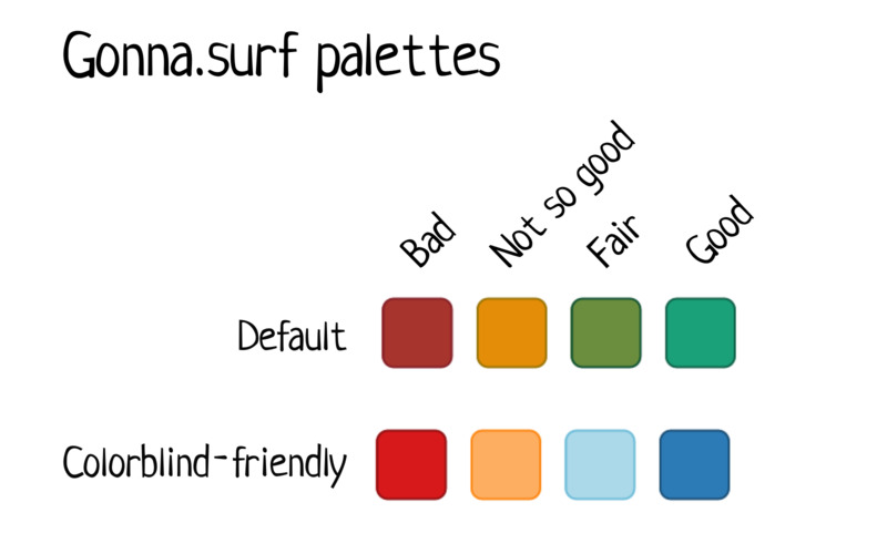
Gonna.surf's forecast recommendations use a Red / Amber / Green color scheme, which is great for most people as it is intuitively straightforward to understand. However, some of the colors used are tricky to distinguish for people with color vision deficiencies.
In order to remain accessible to as many people as possible, gonna.surf offers a colorblind-friendly alternative color palette.
- Go to the preferences menu.
- Tick the checkbox "use colorblind-friendly colors".
- Close the preferences menu.
The setting is automatically saved in your browser and applies to all pages of gonna.surf.
Remark: Gonna.surf's colorblind-friendly palette should be convenient for most types of deficiencies: protanopia, deuteranopia, tritanopia, blue cone monochromacy. If a fully monochrome palette would be better for you, or some other changes would make your browsing experience more convenient, let us know (Instagram, Reddit, Twitter) and we'll try to integrate alternative solutions.
Last update: 15 Apr 2023.